Eventually, a problem will surface with every manufacturing process — suboptimal material, equipment failure, even nonconforming parts. In some cases, the fix is a simple correction to solve the immediate problem.
Other times, a more comprehensive response is required to ensure the problem won’t happen again. Corrective actions are designed to address systemic or recurring quality issues, and they are essential to good quality management. Yet many organizations struggle to simply find and fix problems as they occur, let alone take a strategic view of corrective actions.
Root cause analysis is a tool in the quality ecosystem that gives leadership the power to move beyond removing the nonconformity and actually improve designs and procedures, streamline processes, and anticipate and respond to emerging issues.
As of 2024, 73 percent of organizations report having experienced a recall in the last five years, with 48 percent saying there are more recalls now than there were five years ago1. Discovering the cause of these recalls could be helped by performing a root cause analysis.

Performing a root cause analysis
The goal of root cause analysis is to trace a problem to its origin, whether the origin is equipment, materials, managerial, process-related, or technological failure.
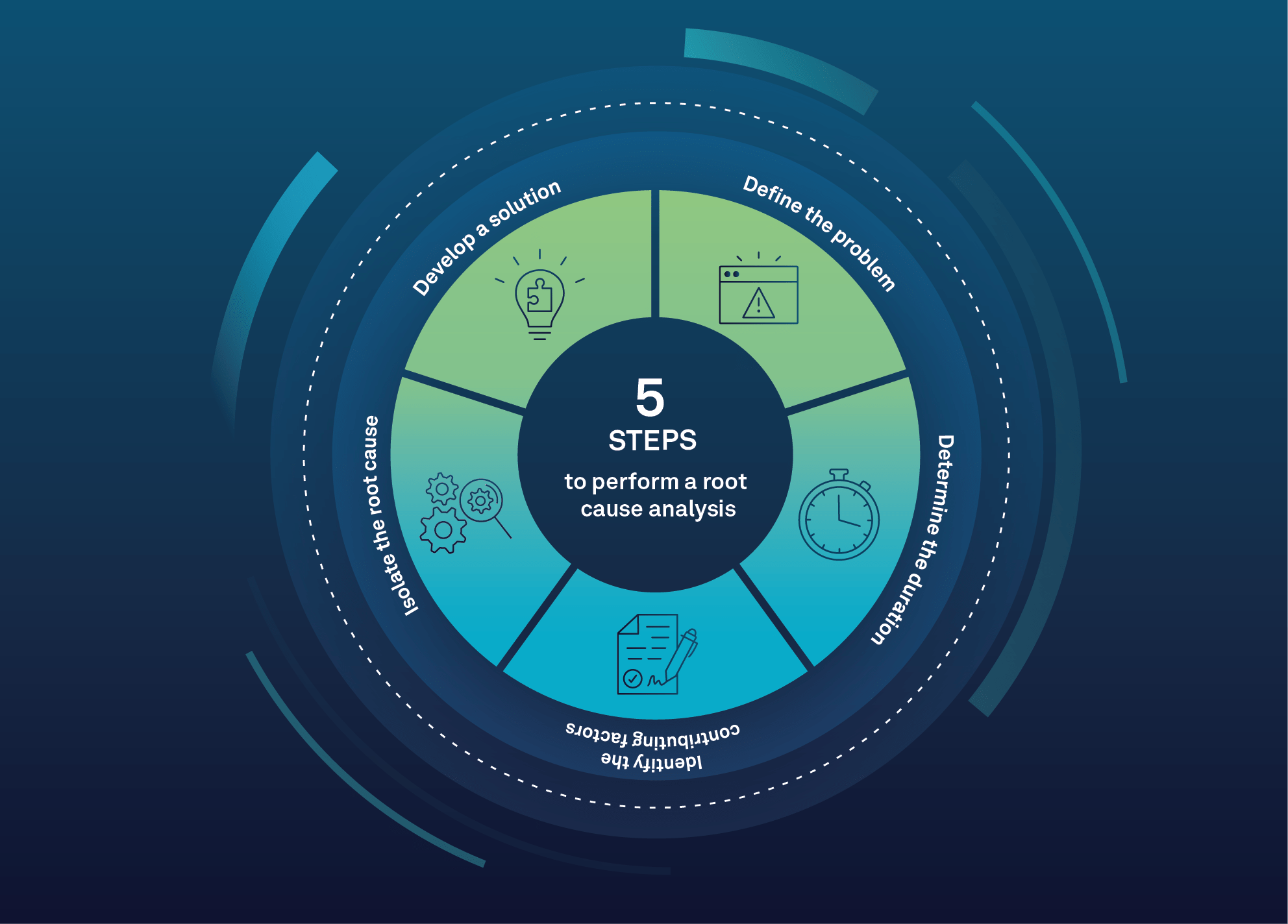
It’s a data-collecting exercise that follows a series of steps:
- Define the problem and document specific symptoms
- Determine the duration of the problem and the severity of its impact on organizational processes
- Identify the contributing factors that may have caused the problem
- Isolate the root cause using one of the root cause methodologies or tools
- Develop a solution to mitigate or eliminate the root cause
Some of these tasks can be performed by a single staff member, but in most organizations, a cross-functional team approach is more effective. The team should include individuals with direct knowledge of the impacted process, members from the quality and engineering departments, and management staff with decision-making authority to implement the solution.
Three essential root cause tools
Moreover, if you require your vendors to vet their own vendors just as diligently, you can add that third-party information into your own QMS, giving you even more insight into your quality management ecosystem. If issues arise, you’ll be able to respond more rapidly and efficiently.
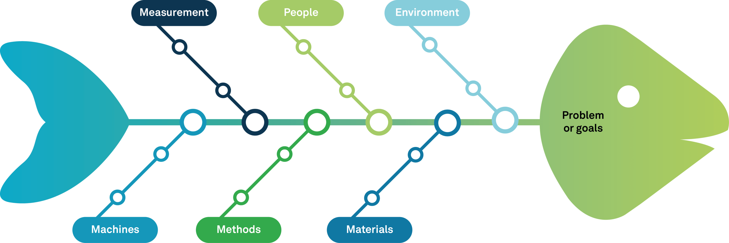
The fishbone diagram
Karou Ishikawa created this tool in 1968 to help teams determine the potential root causes of a problem. The fishbone diagram gets its name from its layout. The problem is listed
at one end and represents the “head” of the fish, and the six potential categories or areas of failure branch out like fishbones.
This method is especially useful for determining cause and effect with complex problems. There are four steps:
1. Identify the problem
2. Ask questions to determine the factors in each of the categories, for example:
“What are the people-related causes of this problem?” “Are there any standardization or measurement issues related to this problem?” “Did environmental conditions such as temperature or pressure contribute to this problem?”
3. Drill down into the “why” of any potential first-level causes (i.e.“why did the sudden rise in temperature occur?”)
4. Analyze the diagram to test possible cause and effect
While the six general categories listed above are most frequently used in manufacturing, other problems and other industries may require different categories. Marketing organizations sometimes use the “7 Ps,” or product, price, place, promotion, people, positioning, and packaging.
Because it’s a highly visual tool, the fishbone diagram is easy to understand and it helps teams identify and prioritize problems and solutions.

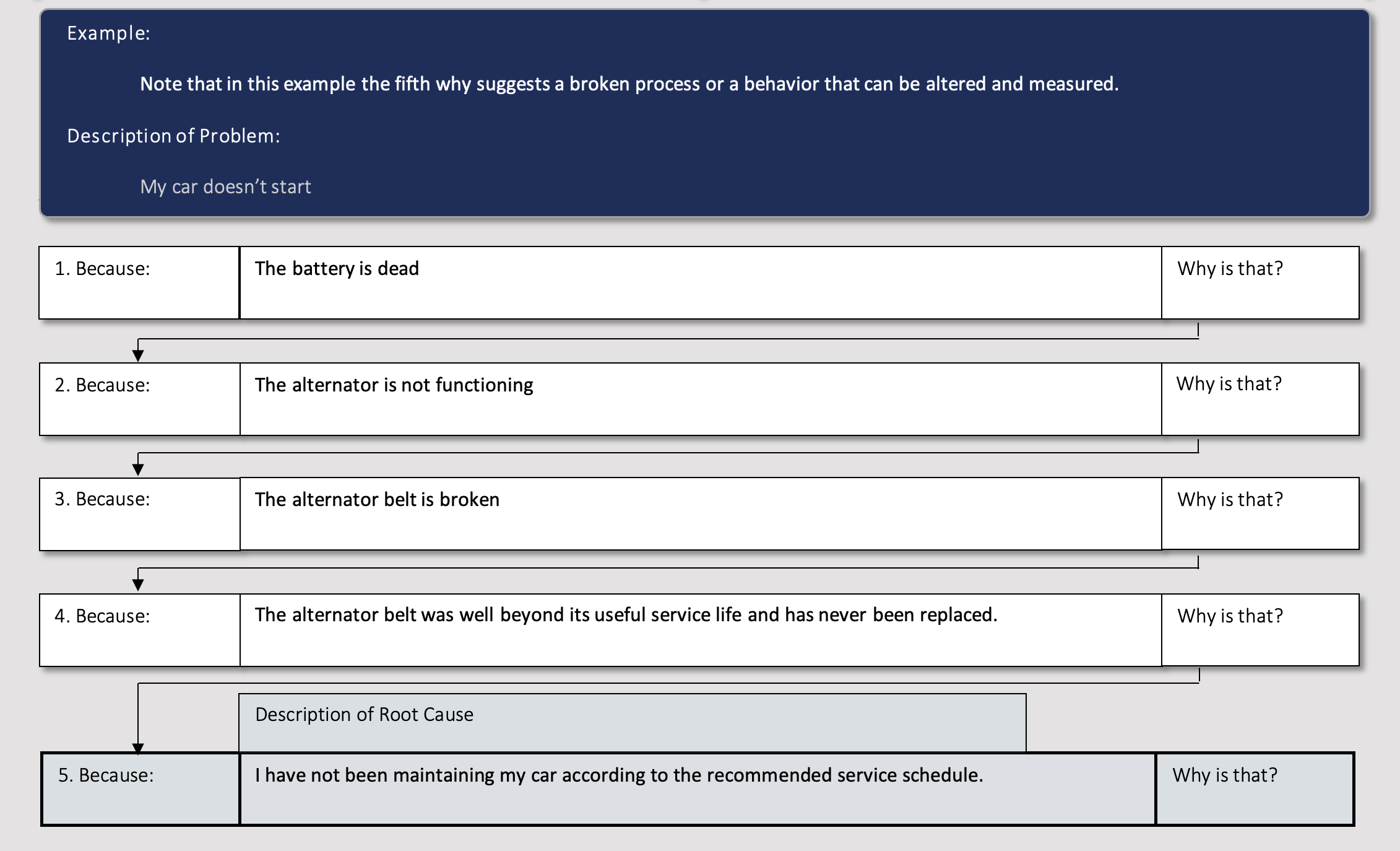
The 5 whys
Sakichi Toyoda, the founder of Toyota Industries, developed the 5 Whys technique to move beyond the symptoms to the root cause of a problem. It can be used for troubleshooting, quality improvement, and solving problems of moderate complexity.
The 5 whys or 5Y tool involves five ordered steps:
- Assemble a team that is familiar with the problem or process that needs to be
- Define the problem with a clear problem statement (“Customer X received products that don’t meet their specifications”).
- Ask The replies must be factual, backed by data, and focused on process or system errors. The team should then determine whether the problem or failure would still occur if the issue identified in the answer was fixed. If the answer is “yes,” ask why again. If the answer is “no,” you have identified the root cause. Note that you may not need to ask why five times to reach the root cause.
- Develop a corrective action based on the root cause or causes you
- Monitor and measure the results of the corrective actions to validate their effectiveness.
One advantage of 5Y is that it allows for exploring multiple contributing root causes.
If, for example, there are two potential answers to the first “why,” the 5Y chart can branch out and follow these additional paths.

The Pareto chart
The Pareto chart is named for Vilfredo Pareto, the father of the “80/20” rule, which for quality professionals, postulates that 80% of the problems come from 20% of the issues. A Pareto chart is a quality tool that helps teams identify where to focus their efforts to achieve the greatest improvement.
A Pareto chart combines a bar chart with a line graph; each bar represents a defect or issue in descending order and the line represents the cumulative percentage of problems. It’s useful to help teams prioritize the most important issue among many and for analyzing broad causes by examining individual components.
The Pareto chart procedure follows these steps:
- Decide which categories and measurements are appropriate for the issues; suggestions include frequency, quantity, and cost. Determine the timeframe to chart such as one week, one sales cycle, or one month.
- Collect and assemble the data and total up the measurements for each
- Draw and label bars along the horizontal axis in descending order. Mark percentages along the vertical axis.
- Calculate and plot cumulative counts and connect them with a line. The dot above the second bar should be the sum of the first and second bars; the dot above the third bar is the sum of the first, second, and third bars. Continue until the final dot represents 100%.
The Pareto chart has multiple uses in the quality improvement process. It can be used in the early stages to help teams identify which business problems are generating the most losses or complaints in order to focus resources on high-return quality initiatives.
It can also be used to concentrate efforts in a large, multifaceted problem with multiple causes. For example, if shipping delays are creating problems in multiple areas of the business, a Pareto chart can help pinpoint which root causes have the greatest impact.
Summary
With the proven tools in our Root Cause Analysis Toolkit, you’ll soon be on your way to improving quality in a structured and data-driven method.
By knowing the true roots of any nonconformance, your organization will be able to inject quality steps further upstream in the product lifecycle, hopefully as early as initial product design.


